Blackmoon is a design and advertising agency based in the City of Tshwane, South Africa. Their core team is made up of South Africans from diverse cultural backgrounds. Being a smaller agency, they're able to think on their feet. When it comes to finding new solutions to old problems, Blackmoon is in a position to be more resourceful and flexible than most.
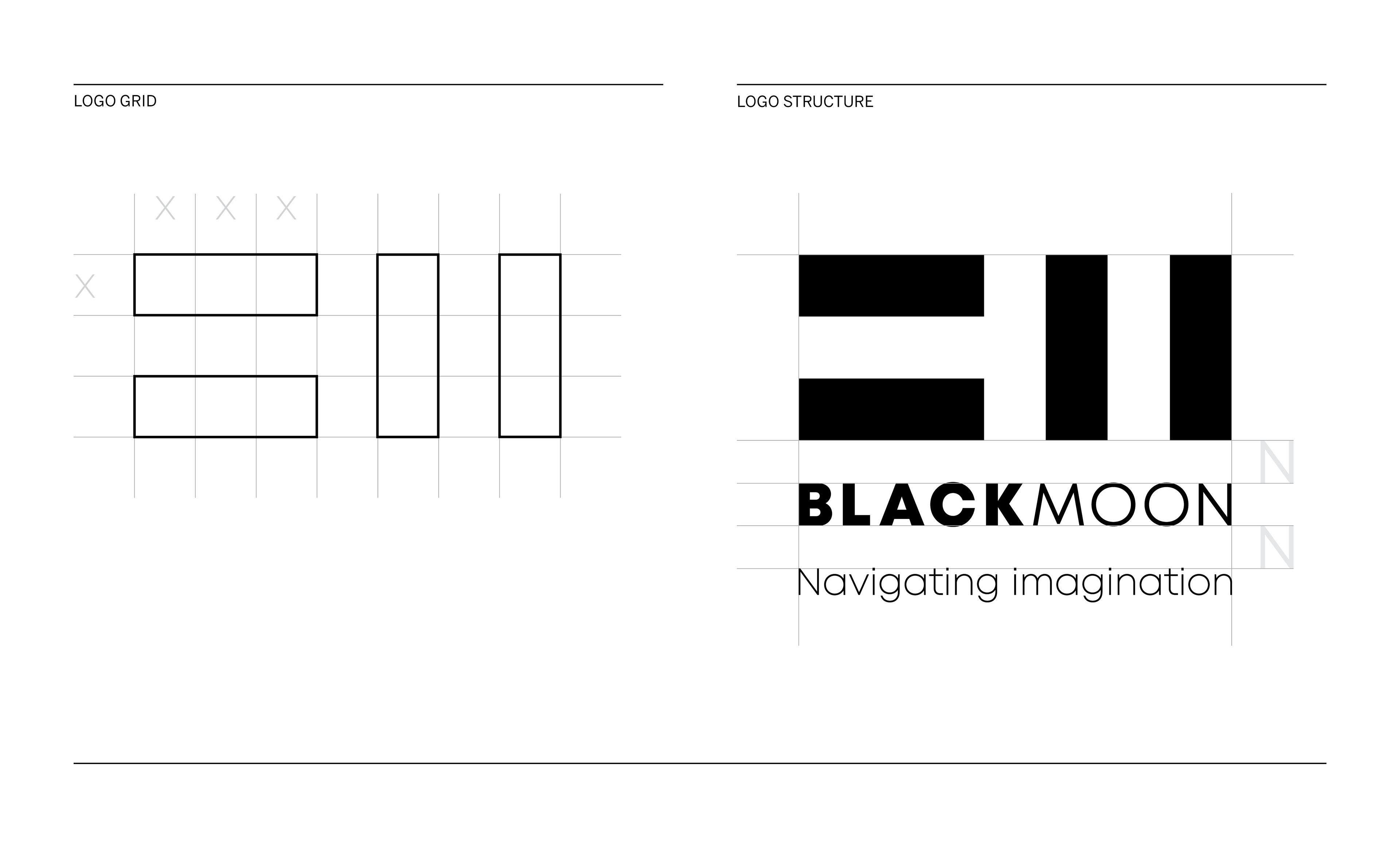
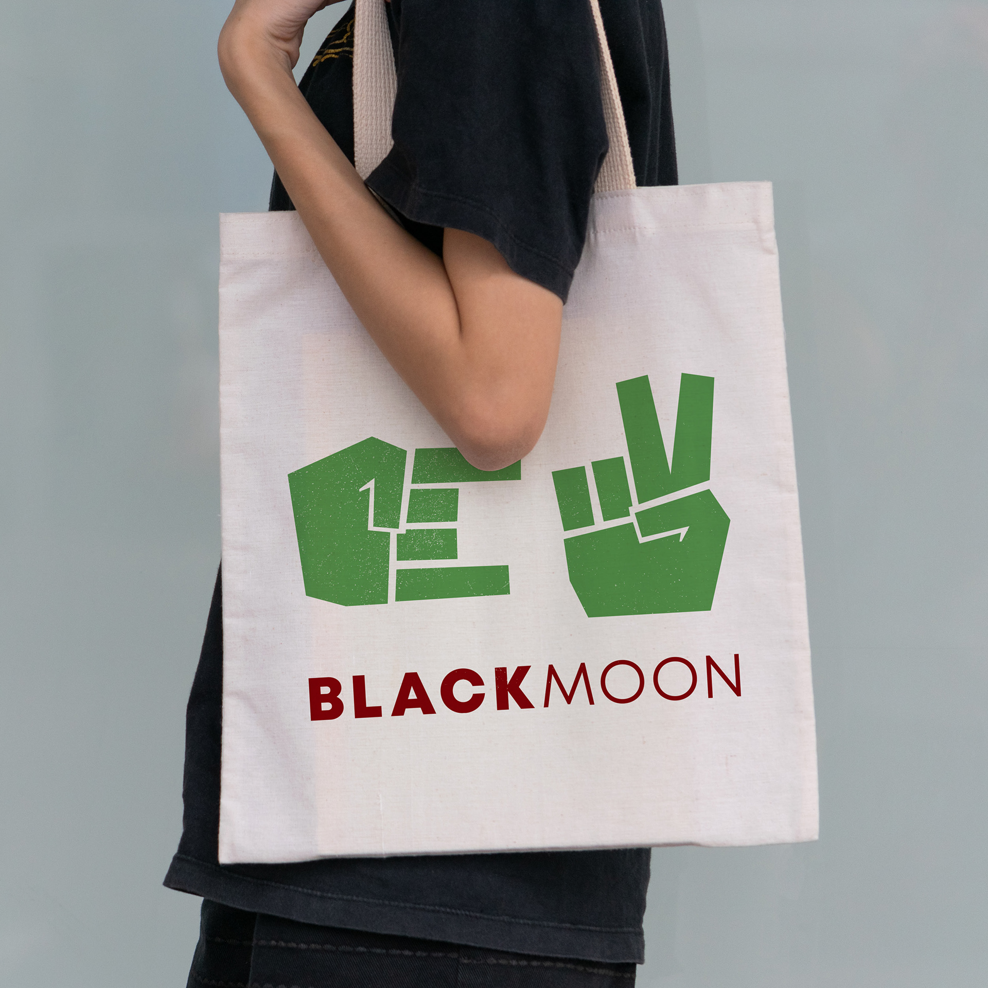
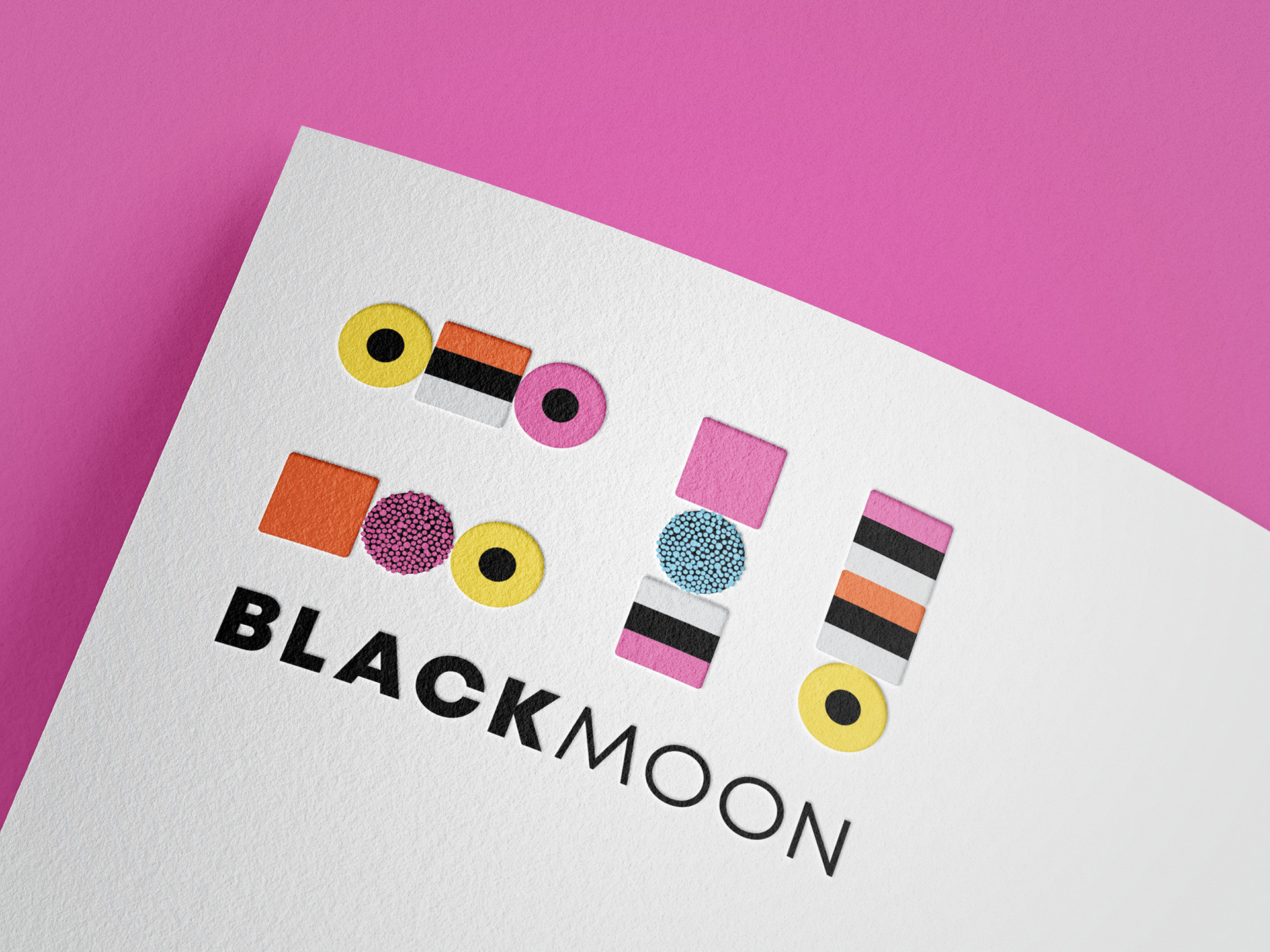
The foundation of the Blackmoon logo had been established by the agency – two sets of parallel bars, one horizontal and one vertical, which represent the B and M found in their name. Using the logo as starting point, I was tasked with creating an identity which expressed their diverse heritage, as well as their multidisciplinary expertise across print and digital.
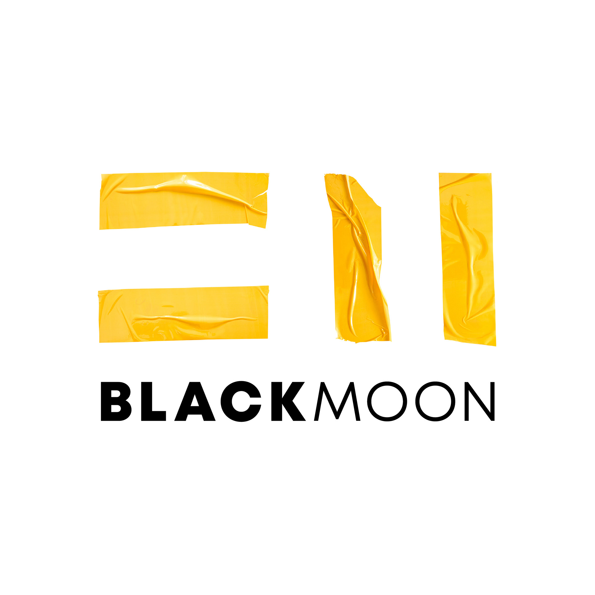
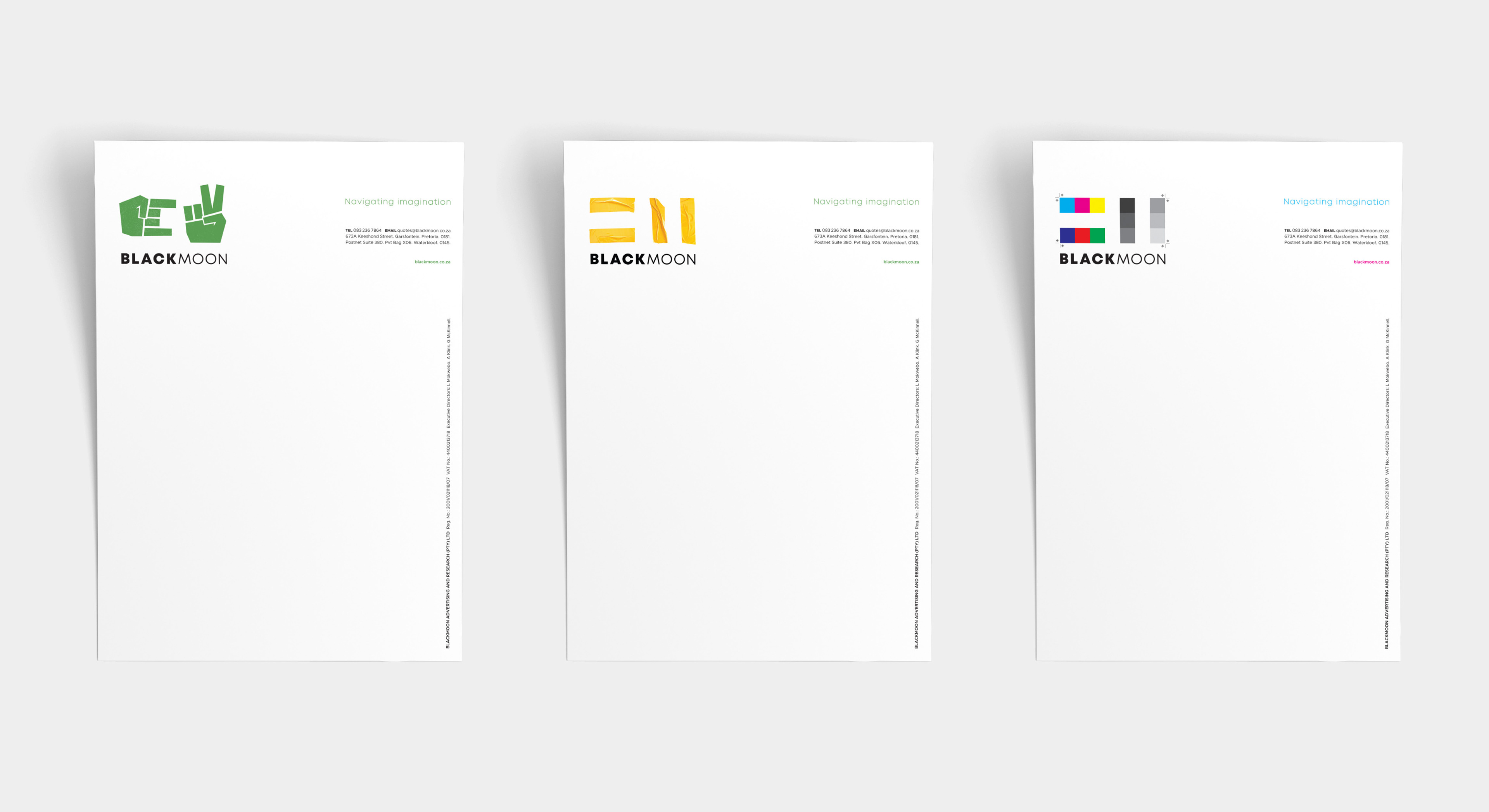
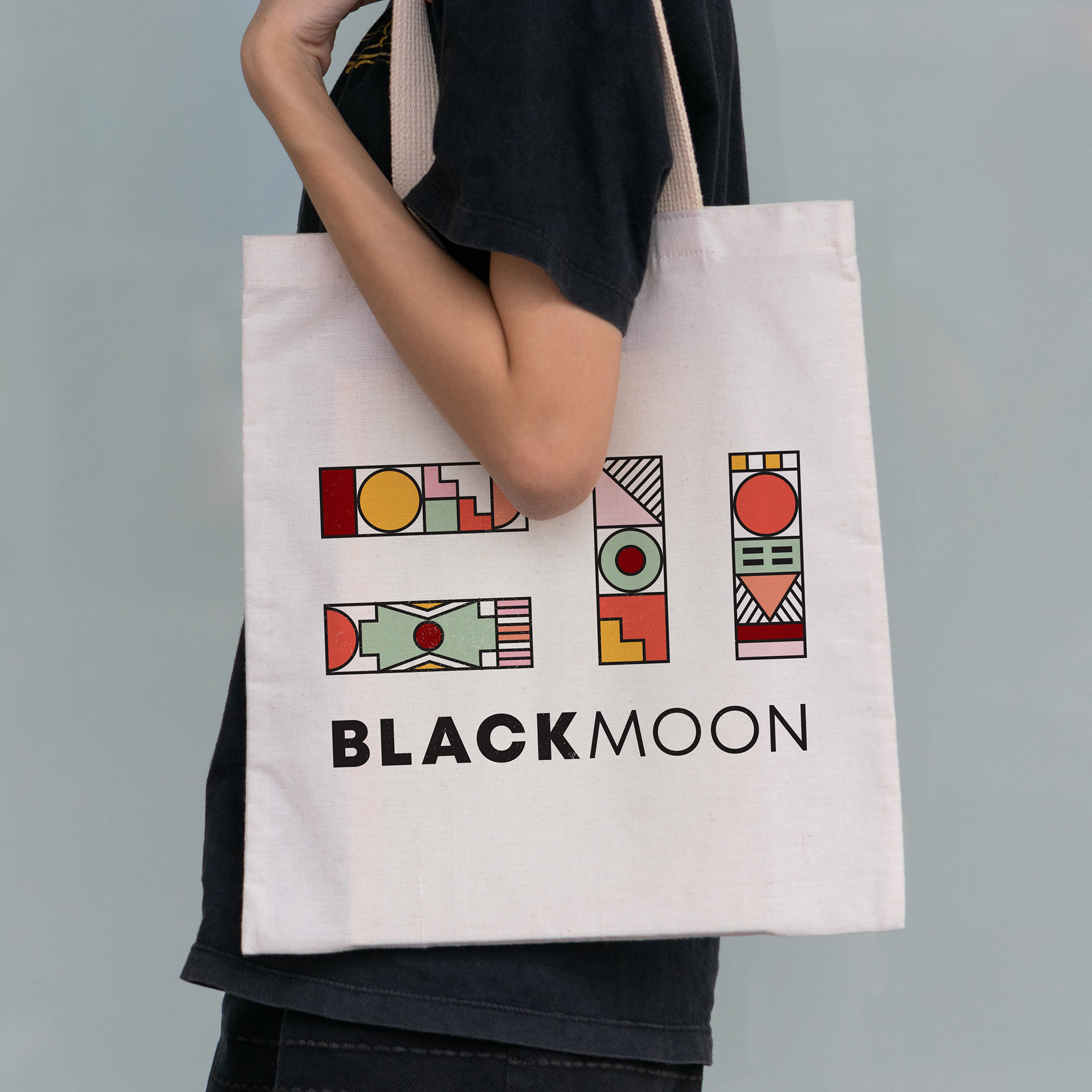
I set up a grid structure for the logo and created a robust word mark to support the solid bars. When it comes to expressing the character of the brand, these bars become a vehicle for telling the Blackmoon story. A range of logo iterations talk to their diverse heritage, resourcefulness and skilled service offering.
My responsibilities
Logo refinement
Logo concept development
Stationery design
Social post design
Brand guidelines
Logo refinement
Logo concept development
Stationery design
Social post design
Brand guidelines
Industry
Design and advertising
Design and advertising